

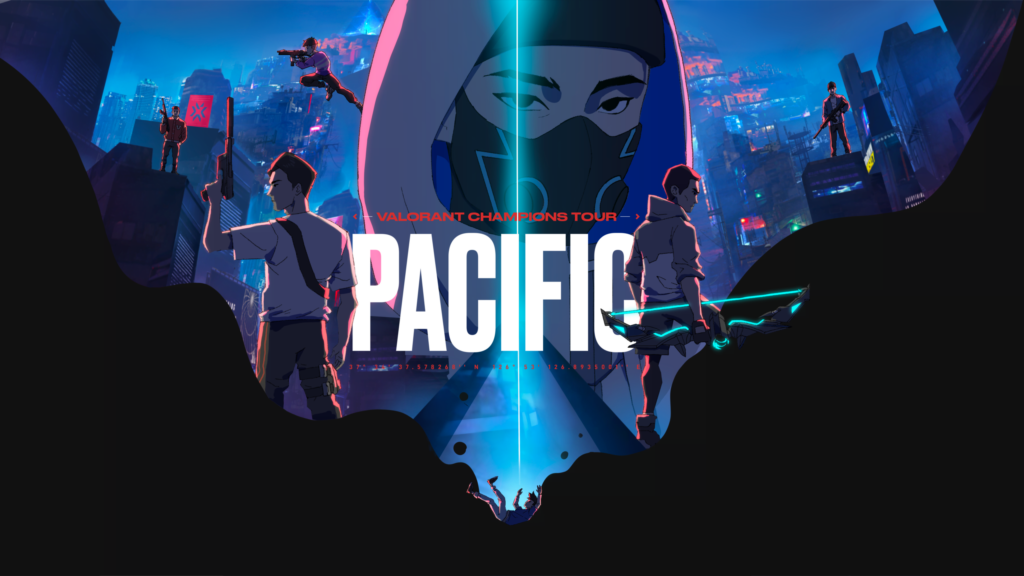
In early 2023, Genesis Motion Design received a brief from Riot Games that would push the studio into new creative territory. The task was not another campaign or commercial — it was the cinematic centrepiece for the VALORANT Champions Tour Pacific, the premier regional esports league spanning Southeast Asia, Korea, Japan, and Oceania. The result would be a manga-inspired animated trailer, an original narrative called “Inner Demons,” and a complete visual world built from scratch — all set to “Making Waves,” an original track by Don Diablo featuring Minnie of (G)I-DLE.
When Riot Games approached the studio, the ask went far beyond the overlay graphics and transition bumpers that define most esports broadcast packages. They wanted a cinematic narrative — a story that would give the VCT Pacific league its own identity, one that could stand alongside the character-rich lore of VALORANT itself.
Creative Director Benjamin Ang saw an opportunity to do something rare in esports animation: build an original world with its own characters, its own visual language, and its own emotional arc. The studio’s background in anime-styled storytelling — from McDonald’s Samurai & Ninja Burger to the Hyperplay esports festival — made Genesis a natural fit for a project that would demand character design, environment art, and narrative filmmaking at a scale the team had not attempted before.
The Pacific region is vast. It spans South Korea, Japan, Southeast Asia, and Oceania — dozens of cultures, languages, and visual traditions. Finding a creative concept that could resonate across all of them without feeling generic was the first major challenge.
The answer was water.
“Making Waves” became the campaign’s unifying theme: water as a connective force that flows between the 10 team districts of the fictional city, as the elemental domain of the central antagonist (the Water Demon), and as a metaphor for the idea that the VCT Pacific league creates ripples far beyond any single match. The theme also gave the animation team a rich visual vocabulary — reflections, refractions, fluid simulations, and the interplay of light through water — that they could deploy differently across every scene.

The narrative built around the “Making Waves” concept tells the story of a Korean hero — a young agent in his early 20s, channelling abilities from VALORANT agents Neon, Yoru, and Harbor — as he pursues the VCT trophy through a dystopian cyberpunk megacity.
What makes “Inner Demons” resonate is that the hero’s obstacles are not external villains. He faces three personified negative emotions: Envy (rendered in toxic green), Anger (burning red), and Fear (personified by the Water Demon, a Leviathan-like force of deep blue). These demons are manifestations of the hero’s own psyche — the self-doubt, jealousy, and anxiety that exist inside every competitor.
The hero is not alone. Five split-personality characters — each referencing the visual language of a different VALORANT agent — embody fragments of his identity. A hooded mentor figure, Master One, guides him through the Wired Wave organisation: a secret sanctuary for people with unusual abilities hidden within the city.
The narrative was delivered across two episodes. Episode 1, “Shadow” — the Title Trailer — introduces the world and follows the hero’s first confrontation with the three shadow enemies in the city’s back alleys. Episode 2, “Tensions Rising” — the Playoffs Premiere — escalates to a full battle between the hero and his split personalities for control of the Power Core.
The character design process was the most intensive phase of production. Unlike a typical campaign — where you might design one or two hero characters — the “Inner Demons” narrative required a full ensemble cast, each member needing a distinct silhouette, colour identity, and movement signature.

The hero design went through multiple iterations. The Genesis team explored variations in facial structure, costume complexity, and overall proportion — balancing an anime-inspired aesthetic with the practical needs of a character who would appear in dozens of action sequences. The final design settled on a look that felt at home in VALORANT’s world without directly copying any existing agent: practical streetwear with subtle tactical elements, warm amber and coral tones to contrast with the cool, saturated environments.

The five split-personality characters were designed as a set — visually distinct but connected by shared design DNA. Each one references a different VALORANT agent’s visual language while serving a specific narrative function. Designing them as a group required careful coordination between the character designers and the animation team, since each personality needed a movement style that reflected their emotional state.

Master One — the hooded mentor — was designed to project mystery and authority. His concealed face and flowing silhouette let him function as a narrative device (the guide who knows the city’s secrets) while providing a darker, more subdued visual anchor against the vibrant designs of the hero and demons.
The environment design was just as ambitious as the character work. Genesis built a cyberpunk megacity inspired by the dense vertical architecture of Hong Kong, Seoul, and Busan — elevated bridges linking 10 team districts, neon signage rendered in multiple scripts, and atmospheric haze that gave the city depth and scale.

Each of the 10 team districts carries its own architectural language and colour identity. The bridge network connecting them serves as both a visual motif and a narrative device — transition points between story beats, spaces where the hero pauses before descending into the next confrontation.

The most technically challenging environment was the Abstract Realm — the water-dominated dreamspace where the hero confronts the Water Demon. The team pushed the visual language into abstraction here, using fluid simulations and refractive lighting to create an otherworldly arena that still felt connected to the city above.
The animation brief called for something that did not look like a conventional esports graphic. Genesis developed a manga-inspired visual approach: chunky, textured linework with variable-weight ink strokes — deliberately imperfect — and cel-animated motion blur using smear frames, a technique borrowed from traditional hand-drawn anime.
Character animation was rendered on 2s and 3s (12 to 8 frames per second) within a 23.97 fps timeline. This created a deliberate “anime cadence” — the slight stutter of hand-drawn animation that, counterintuitively, makes motion feel more organic than the perfectly smooth interpolation of digital tweens.
The colour palette was another deliberate choice: a desaturated, high-contrast base with selective colour pops. In most scenes, the only fully saturated elements are the three demons — green, red, and blue — making them feel like intrusions from another visual plane. The effect is that the “real” world of the city reads as muted and oppressive, while the demons carry an almost radioactive visual charge.
Music was not an afterthought — it was baked into the creative brief from day one. The campaign’s soundtrack, “Making Waves” by Don Diablo featuring Minnie of (G)I-DLE, provided the emotional and rhythmic spine for both trailers.
The animation team timed key action beats — punches, explosions, environment reveals — to the music’s drops and transitions. This tight audiovisual lock is what makes the trailers feel cinematic rather than promotional. The collaboration with Don Diablo, who commands a global electronic music audience well beyond gaming, also served a strategic function: it signalled that the VCT Pacific league was positioning itself as premium entertainment, not just a competitive event.
The studio received the full track as well as stems, allowing the sound design team to isolate and emphasise specific elements — vocals for character-driven moments, percussion for action sequences, synth layers for atmospheric transitions.
The project produced over 50 distinct assets across a 5+ month timeline — substantially larger than a typical studio campaign. The Title Trailer alone required a 4K master, YouTube and social versions, textless cuts, broadcast-spec renders (HD, 59.94fps, 16:9 with -12dB audio), teaser cutdowns in both portrait and landscape, countdown videos, subtitle files, thumbnails, and a localisable After Effects project file. The Playoffs Premiere followed the same structure at a shorter runtime, adding 24-hour countdown variants. Beyond video, the team delivered broadcast bumper assets, end cards, two key art pieces at 4K+, print-ready stills at 8K resolution, production stills, animated stickers and GIFs, an original audio track with stems, and a location poster mapping the 10 team districts.
The VCT Pacific cinematic marked a turning point for Genesis Motion Design. It proved that the Singapore studio could carry a narrative-driven animation project of international scale — original characters, original world, original story — and deliver it to a global audience on Riot Games’ platform. It deepened a creative relationship that began with Hyperplay, the inaugural ASEAN esports and music festival, and positioned the studio for the kind of work that sits at the intersection of animation, gaming, and entertainment branding.
For the team, “Inner Demons” was also a personal project. The story of a hero confronting self-doubt, envy, and fear — and emerging stronger — mirrored the creative risks the studio took in pitching an original narrative instead of a conventional broadcast package. The fact that Riot Games said yes to that pitch is a reminder that the best client work often starts with the most ambitious ideas.
See the full case study with production stills, character designs, and styleframes at VALORANT Champions Tour Pacific — Case Study. For broadcast animation, character design, or esports creative work, contact Genesis Motion Design.
Benjamin Ang, the Creative Director of Genesis Motion Design, has more than 10 years of experience in motion graphics, design, and animation, Benjamin embarked on his own journey in 2015 with the birth of Genesis Motion Design, a studio focused on brand-driven storytelling.